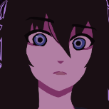
betetiro Posted April 30, 2023 Share Posted April 30, 2023 Hi there! I'd like to share my art with you and ask for your feedback on the style. I've combined pixel text, manga brush, and a simple brush in a single image. I hope it works well, but I need your feedback. Additionally, I'd like to know how many scene artworks my game should have. I'm concerned about creating fewer than what my fans expect, so I would really appreciate your suggestions. Thank you for your attention! NoriNori, Emi, Plk_Lesiak and 1 other 3 1 Quote Link to comment Share on other sites More sharing options...
NoriNori Posted May 1, 2023 Share Posted May 1, 2023 Hey, I really like the art style it gives of a very dark atmospheric vibe and the pixel text adds to the "disconnect from reality" part, if that's what you were going for, then it's done really well. Honestly you don't need to stress yourself out regarding the amount of scene artworks. I think the quality of the writing is more important than the quantity of specific artworks you implement. (Also to clarify with "scene artworks" you mean something like "CG's" right? Or do you mean new backgrounds?) If you mean it like I think you did, then you should only reserve them for climax points in the story, it would just make the important points in the story pop. You don't need to make one for every little action a character does (Patting on the shoulder, dropping something, eating something etc.). You can just use screen and sprite shakes, and sfx for those instead. TL;DR the amount of effort put into making an event stand out, should be proportional to it's importance in the story. I've wish-listed the game on steam a few days ago and I think the art is well-done and fits the mood and the base plot's got potential! The only thing that could flop this game is the execution of the writing, if you can deliver on that instead, then you got something great going on here. Keep working hard and best of luck, I'll be rooting for you. Quote Link to comment Share on other sites More sharing options...
Emi Posted May 3, 2023 Share Posted May 3, 2023 i think it looks cool and yea i agree, quality of quantity. just do what you can, more fun if you dont stress about it Quote Link to comment Share on other sites More sharing options...
sanahtlig Posted May 3, 2023 Share Posted May 3, 2023 (edited) The quality and variety of sprites will probably matter more than the number of CG in this sort of game. Reserve full CG for climactic points that you want to highlight. But I suspect your question is actually about the game's presentation on your store page. CG make for good promotional images. Your Steam page is definitely suffering from a shortage of high-quality screenshots--you even included a fairly non-descript title screen! Text screenshots can be ok, but the re-use of the same background in all such images gives a cheap/bland feel and evokes a scope that is suffocatingly claustrophobic (are we really going to be talking to the demon on a single static background the whole game???). Right now the most evocative screenshot is probably the one of the puzzle gameplay. You need variety and movement in the artwork (sprites, background, CG), in the game also but especially in the screenshots. Even if the game takes place entirely within one room, you'll need multiple backgrounds and perhaps versions of those backgrounds. If your focus is on horror, simple filters over the backgrounds (blur, change in color, etc.) at appropriate moments could add a lot to the atmosphere (really key in the horror genre) without running up costs. And if push comes to shove, generative AI is always an option for increasing variety at low cost--it seems to be pretty decent at backgrounds. In short, by making good use of sprites and backgrounds, you'll actually reduce your dependence on expensive CG to create movement and immersion. I suppose I should give a brief nod to what I like too. The character artwork is appealing and the single background you've shown is adequate for the task. The quality is there, you just need sufficient quantity. The screenshots show multiple high-quality sprite poses, which leaves a favorable impression, though showcasing changes in facial expression would further increase appeal. Edited May 10, 2023 by sanahtlig Plk_Lesiak 1 Quote Link to comment Share on other sites More sharing options...
Plk_Lesiak Posted May 8, 2023 Share Posted May 8, 2023 You already got some quality feedback here and my idea os probably worthless, but the main thing that stuck to my mind observing the overall aesthetic is that it would look more consistent if you went full pixelart... Or maybe just using some additional effects on the sprites to make them blend better? I like what you've done already, but it lacks the stylistic consistency of Milk outside a bag of milk outside a bag of milk for example. Quote Link to comment Share on other sites More sharing options...

Recommended Posts
Join the conversation
You can post now and register later. If you have an account, sign in now to post with your account.